INTERIOR DESIGN
Paint Colours
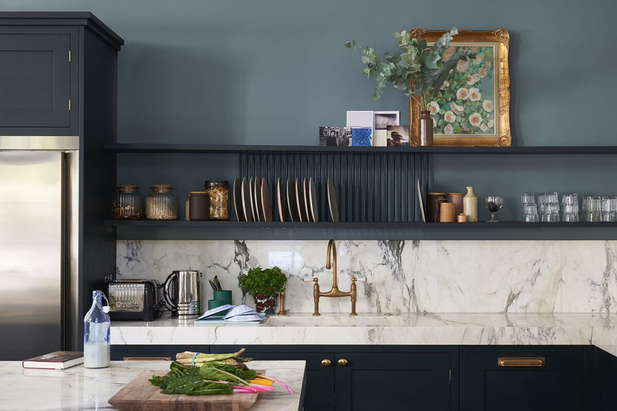
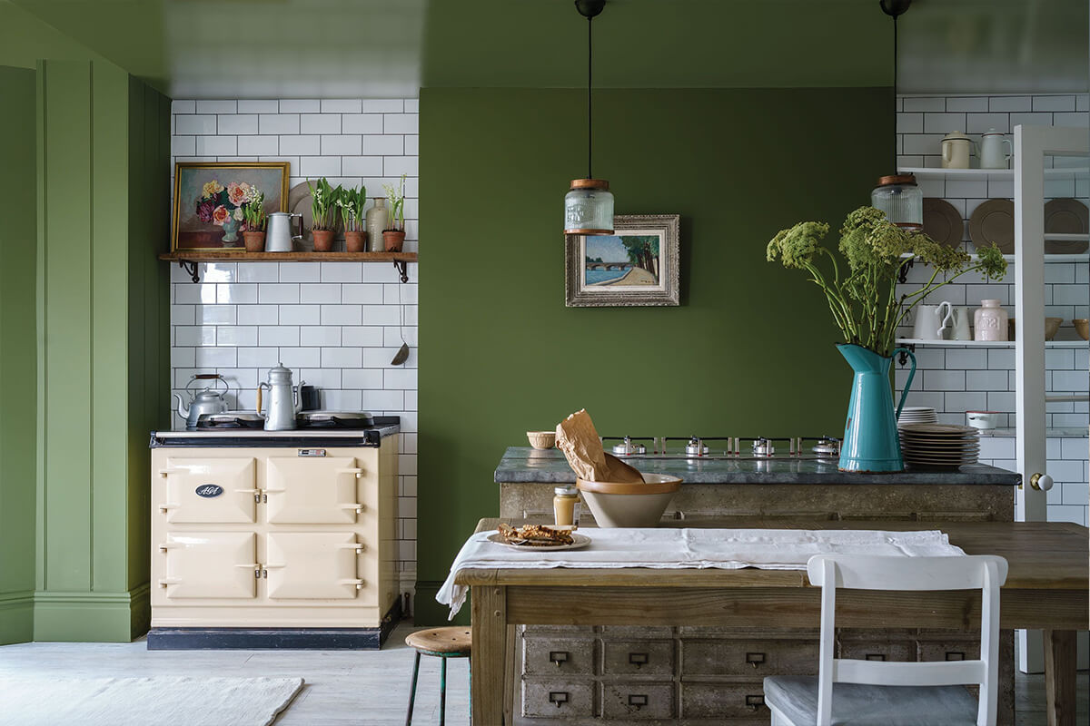
We base our colour schemes on a range of popular brands including Farrow and Ball © Little Greene and Paint and Paper Library colour palettes but constantly adapt to new trends in colour, tone and finish.
Of course, colour choice and palette are very personal and entirely subjective decisions and of course that is it how it should be. We can guide and suggest some popular combinations that will help to create the mood and the feeling that you want from your décor. In addition, the colour combinations can also enhance and provide accents of design that are most important. Together with appropriate lighting the combined effect can be simply stunning.
There are trends in colour choice that we see emerging and we can recommend solutions that you might not always have thought about. This can result in a bold and unlikely combination that will need a degree of confidence to employ. We can help you with that process and support you in ensuring that the final choice is what you are comfortable with as well as enhancing the finished work.

PAINT FINISHES
Colour and combinations of colours is fundamental of course, but the paint finish can also be used to good effect. Whilst the current trend is for matt and muted finishes combining this with a light egg-shell or satin finish, particularly in window reveals or feature walls can be very effective. The play of light through daylight reflections is like well-placed and thoughtful lighting solutions generally.
We want you to be happy with your new home for a long time and part of that is ensuring that that the finish is long lasting and durable. Some paints are better at withstanding the frequent cleaning that might exist on kitchen surfaces for instance. Whatever room we help you to build we will make sure that the paint finish is durable, appropriate and enhances the furniture.
HELP WITH COLOUR AND FINISHES
We have found that the best way to start to narrow down the vast array of colour combinations is to try to produce and provide examples on a mood board. This can be as simple as a scrap book or photo album of pictures that you like, articles that you have seen or even shade cards from paint suppliers. Getting some small sample pots and starting to experiment with combinations of colours can be a great way to begin to focus on what will work well and what tints are a good starting place.

Colour combinations can also be simulated on software that we use to design the furniture and will be very useful to help to allay those niggling doubts about whether you have made the right decision. Our experience and judgement are helpful in providing design themes and the right colour combination can set the whole ambience and feeling of your home that we will be supporting, but ultimately it will be your decision.
We want our work to be around for a long time and to stand the test of changing tastes and trends. Colour choice and finishes can provide that longevity that make sure that the work doesn’t date, that you remain happy with the finished product for a long time and that it provides the feeling and ambience of a lovely home.


